Plotting (Need) Exercises
Exercise 1 (Fill in the blanks) Fill in the blanks(indicated with a ?), so the code below will produce the plot shown.
# Some data for plotting
x = [0, 1, 2, 3, 4, 5]
y = [0, 4, 8, 12, 16, 20]
y_err = [0.0, 0.5, 1.0, 1.5, 2.0, 2.5]
x_err = .25

plt.errorbar(x, y,
             xerr=?, yerr=?,
             color=?, linestyle=?,
             marker=?, markerfacecolor=?,
             ecolor=?,capsize=5,
             label=?)
plt.xlabel('x-values')
plt.ylabel('y-values')
plt.title('X vs Y')
plt.grid(alpha=.25)
plt.legend(?)
plt.show()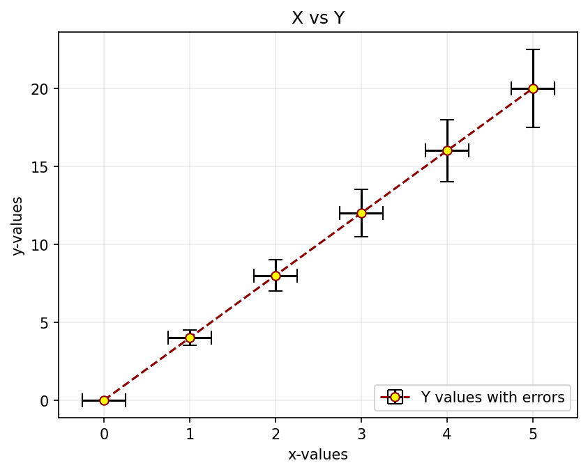
Exercise 2 (A simple mathematical plot)
Use NumPy to generate \(x\) and \(y\) data suitable for plotting the graph of the function: \[ y = e^{-x/10}\sin(x)\]
for values of \(x\) in the range \(0\) to \(50\).
Customise your plot so that:
- The x and y axes have labels of
fontsizeof 15 - The x and y axes labels are in the
color,darkorange. - There is a grid with an opacity of 25%.
- Indicate the equation of the function in the title with a font size of 20.
Hint: Look at Writing mathematical expressions in Matplotlib. - Change the \(y\) limit (using
ylim) to \([-1,1]\)
- The x and y axes have labels of
In the end, your plot should look like the one shown alongside.

Contributed by Darren Teo